Selected Work
A curated selection of brand systems, digital execution, and insight-led marketing strategy focused on clarity, growth, and real-world impact.
Integrated case study: Brand & Execution
Sponsored by Herman & Wallace Pelvic Rehabilitation Institute
Brand, website, and integrated marketing for a pelvic rehabilitation healthcare workforce conference. Led full creative direction and execution to support vendor engagement, registrations, and long-term brand growth.
Role: Director of Marketing & Customer Relations, Herman & Wallace Pelvic Rehabilitation Institute
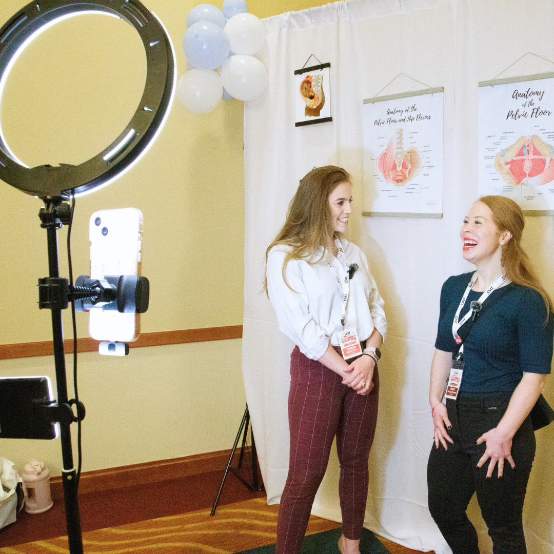
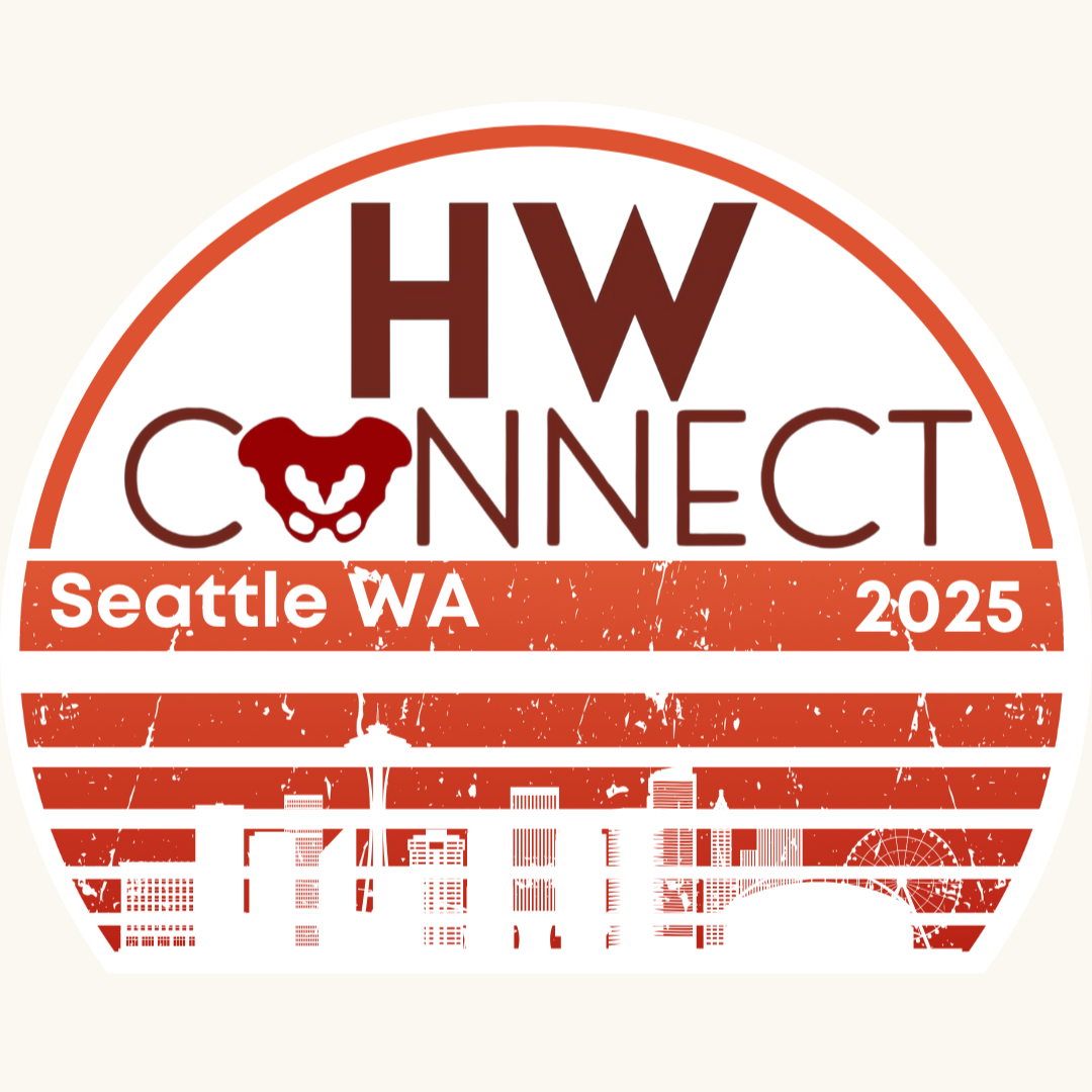
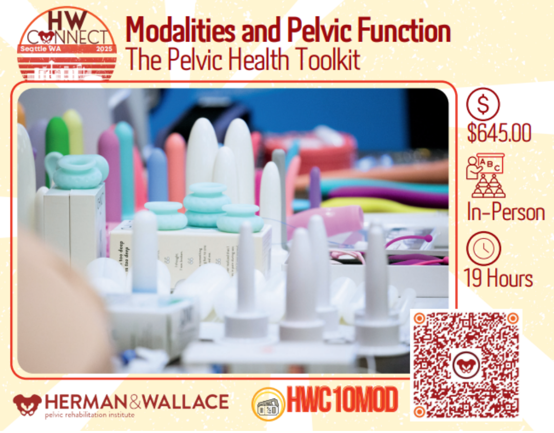
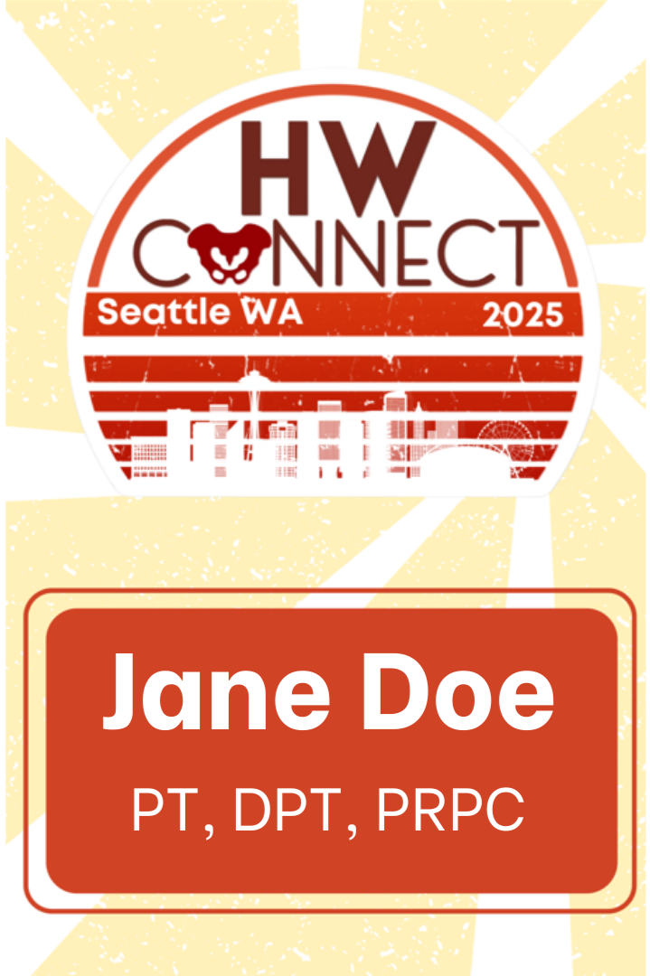
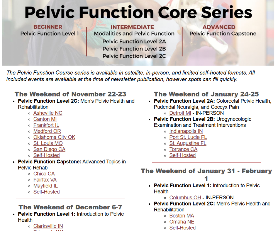
HWConnect 2025
Herman & Wallace engaged me to lead the full brand and marketing development for the second iteration of its pelvic rehabilitation workforce conference, HWConnect 2025. Building on a prior event in 2023, the goal was to elevate the conference into a cohesive, professional brand experience that could drive interest, attract vendors and partners, and increase registrations.
Overview
While HWConnect had an existing name and logo from its first event, it lacked a complete brand system and integrated marketing foundation. The 2025 conference required clearer positioning, consistent messaging, and a polished visual and digital presence to support growth, credibility, and broader engagement across the pelvic health community.
The challenge
I led the creative direction and marketing strategy with full creative control for the 2025 conference. Work began with refining the event’s positioning within the pelvic rehabilitation and healthcare workforce space, followed by development of a complete brand system and coordinated marketing approach to support vendor recruitment, promotion, and registration.
Role & approach
• Brand positioning and messaging framework tailored to pelvic rehabilitation professionals and industry partners
• Full visual identity system expansion, building on the existing logo with a defined color palette, typography, and brand applications
• Website design and copy to support awareness, vendor participation, and attendee registration
• Marketing materials and digital assets for promotion across channels
• Integrated campaign support to create momentum leading up to the event
The solution
• 124 registrations generating $70.7K in revenue
• Vendor participation doubled year over year (6 → 12)
• Registrations driven by coordinated, multi-channel marketing campaigns
• Mobile-first experience supported the majority of registrations
• Cohesive brand system improved clarity and consistency across all communications
• Standardized materials strengthened vendor and partner outreach
• Established a scalable brand and marketing foundation for future HWConnect events
Results & impact
Project-based engagement over a six-month lead-in period · Brand strategy, identity system, website, and marketing execution.
Scope & timeline
With full creative ownership, this work transformed HWConnect from a one-off event into a clearly positioned, repeatable conference brand within the pelvic rehabilitation community.
Key takeaway
Note: For the inaugural HWConnect event in 2023, my role was limited to logo design. For the 2025 conference, I held full creative and marketing responsibility.


Integrated case study: Strategy & Insight
Herman & Wallace Pelvic Rehabilitation Institute
Insight-led marketing initiative that identified a key enrollment friction point and introduced a targeted content solution, driving significant month-over-month registration revenue growth.
Role: Director of Marketing & Customer Relations, Herman & Wallace Pelvic Rehabilitation Institute.
Enrollment Growth Strategy
While analyzing enrollment behavior, I identified a pattern of practitioners completing a single course and then disengaging for 12 months or more. Rather than assuming a messaging or pricing issue, this project focused on uncovering the real barrier to continued engagement and addressing it through a low-friction, insight-driven solution.
Overview
Herman & Wallace offers a wide range of continuing education courses, but busy clinicians were not consistently returning to enroll. Existing marketing efforts promoted individual courses but did not address the underlying effort required to find options that fit complex schedules.
The challenge was not awareness—it was accessibility.
The challenge
To validate the root cause, I conducted a targeted email survey of practitioners who had enrolled once but had not returned in over a year.
Key findings included:
• 76% cited lack of time to navigate the website and search for available courses
• Interest in continued education remained strong
• The primary barrier was friction, not disengagement
Role & approach
Based on these insights, I introduced a bi-monthly “Tuesday Course Lineup” newsletter designed to reduce decision fatigue and time cost.
The newsletter:
• Listed upcoming available courses in a concise, scannable format
• Removed the need for browsing or filtering
• Allowed clinicians to review options in under two minutes
The goal was not to persuade, but to simplify.
The solution
• Generated approximately $40K–$70K in additional monthly registration revenue
• Re-engaged practitioners who had been dormant for 12+ months
• Improved visibility of available courses without increasing marketing spend
• Demonstrated the revenue impact of removing small but meaningful friction points
Results & impact
Effective strategy often comes from listening rather than amplifying. By identifying and eliminating a single point of friction, this initiative drove measurable growth and reinforced the value of insight-led marketing over complexity.
Key takeaway
With Herman & Wallace, we weren't trying to reach everyone. We were reaching clinicians who needed very specific expertise, so every piece of content had to actually matter. If something didn't land, I'd hear about it. If it worked, I could see it in enrollment and revenue.
Integrated case study: Website & Conversion Strategy
Herman & Wallace Pelvic Rehabilitation Institute
Redesigning a manual, high-stakes certification process into a clear, web-based application experience for clinicians.
Role: Director of Marketing & Customer Relations, Herman & Wallace Pelvic Rehabilitation Institute
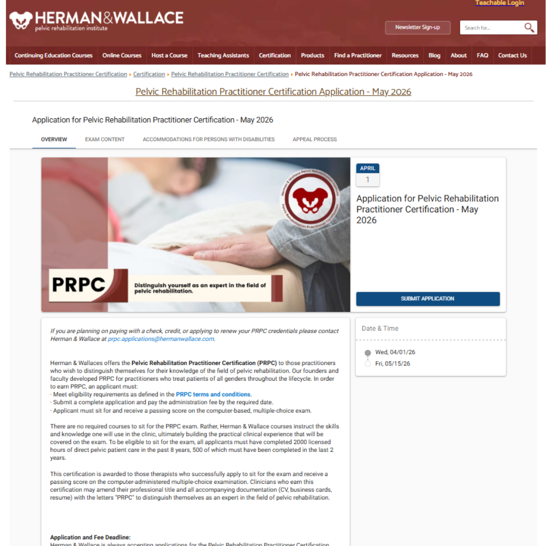
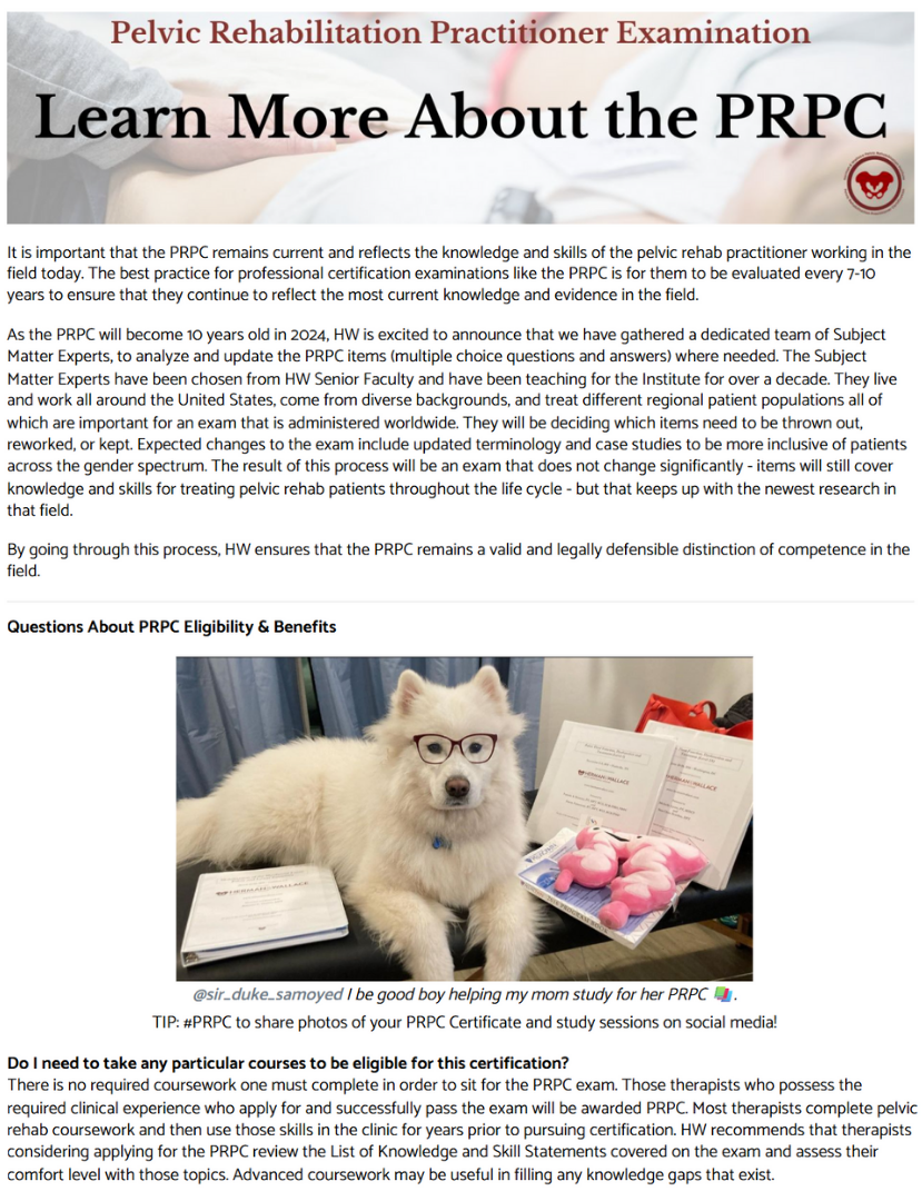
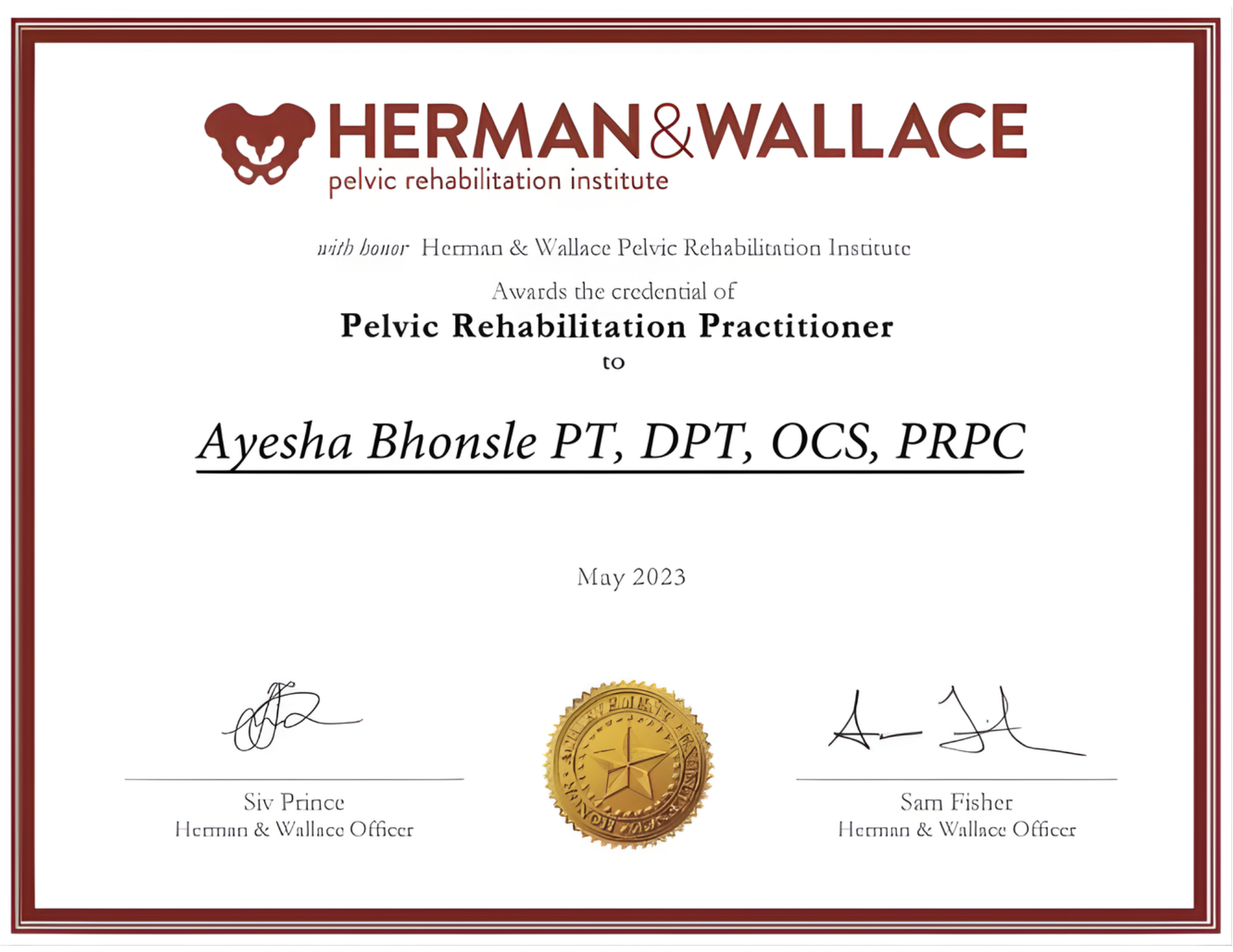
PRPC Certification Application
The PRPC certification represents a major professional milestone for pelvic rehabilitation clinicians. This project focused on transforming the PRPC application experience from a fully manual, offline process into a clear, web-based application flow that reduced friction, improved clarity, and supported confident decision-making for qualified applicants.
Overview
Prior to this work, the PRPC application process was entirely manual. Clinicians were required to download a PDF application and submit it via email or physical mail. This created several barriers:
• High friction for busy healthcare professionals
• Unclear expectations around eligibility and requirements
• Increased administrative burden for both applicants and staff
• Drop-off risk during a high-consideration decision process
The challenge was to modernize the experience without diminishing the rigor or prestige of the certification.
The challenge
The application page was treated as a decision and action hub, not simply an informational page.
Key strategic priorities included:
• Moving the application process online to reduce manual steps
• Surfacing eligibility and prerequisites early in the page experience
• Structuring information to answer common clinician questions upfront
• Reducing cognitive load through clearer hierarchy and formatting
• Maintaining clinical authority while improving usability and accessibility
Strategy & approach
• Transitioned the PRPC application process from a downloadable PDF to an online application experience
• Redesigned information architecture to prioritize application-critical content
• Conversion-focused content hierarchy aligned to clinician decision-making
• SEO-informed copywriting to support clarity and discoverability
• Clear, plain-language breakdown of requirements, timelines, and next steps
• Formatting optimized for scanning and comprehension
• Collaboration with internal subject matter experts to ensure clinical accuracy
• Alignment with existing certification review and approval workflows
The solution
• Removed a significant barrier by eliminating a fully manual application process
• Reduced friction for clinicians evaluating eligibility and applying
• Improved clarity and confidence around certification requirements
• Decreased administrative complexity for internal teams
• Established a scalable, repeatable framework for future certification and application pages
Results & impact
Modernizing a high-stakes application process isn’t about making it flashier—it’s about removing unnecessary effort so qualified professionals can move forward with confidence.
Key takeaway


Integrated case study: Content & Insight
Herman & Wallace Pelvic Rehabilitation Institute
SEO-informed, clinically grounded content program supporting subject matter experts, reinforcing industry authority, and driving measurable course enrollment growth.
Role: Director of Marketing & Customer Relations, Herman & Wallace Pelvic Rehabilitation Institute
Blog Strategy & Editorial Planning
As the leading education provider in pelvic rehabilitation, Herman & Wallace’s credibility depends on translating advanced clinical knowledge into accessible, trustworthy content. This case study highlights how long-form blog content was used strategically to reinforce the organization’s position as the gold standard in pelvic rehab education, support subject matter experts, and directly drive course enrollment.
Overview
Herman & Wallace offers a wide range of continuing education courses, but busy clinicians were not consistently returning to enroll. Existing marketing efforts promoted individual courses but did not address the underlying effort required to find options that fit complex schedules.
The challenge was not awareness—it was accessibility.
The challenge
Blog content was treated as a strategic extension of the education model rather than a marketing afterthought.
Each post followed a consistent framework:
• Clear educational objective aligned to a specific course
• SEO-informed topic selection and structure
• Collaboration with subject matter experts to ensure accuracy and credibility
• Defined word counts to balance depth with readability
• Formatting optimized for scanning and clinical reference
• Repurposing into newsletters to extend reach and reinforce messaging
This approach positioned instructors as thought leaders while reducing the lift required from them.
Role & approach
• SEO-informed blog strategy aligned to course offerings
• Original long-form blog writing and editing
• Clinical content review and refinement in partnership with instructors
• Formatting for clarity, scannability, and accessibility
• Content rewriting and adaptation for newsletters
• Ongoing content management and publishing
• Coordination with graphic design and custom illustrations as needed
The solution
• Strengthened Herman & Wallace’s reputation as a trusted clinical authority
• Increased discoverability of courses through evergreen educational content
• Enabled subject matter experts to focus on teaching while marketing content remained accurate and aligned
• Created a repeatable, scalable content system tied directly to enrollment goals
Results & impact
Ongoing engagement · Content strategy, SEO, writing, editing, publishing, and cross-channel adaptation.
Scope & timeline
When educational content is built around clinician needs, subject matter expertise, and clear objectives, it becomes more than marketing—it becomes a growth engine that builds trust, authority, and measurable enrollment impact.
Key takeaway

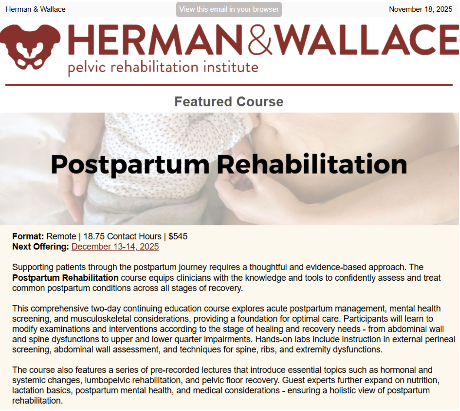
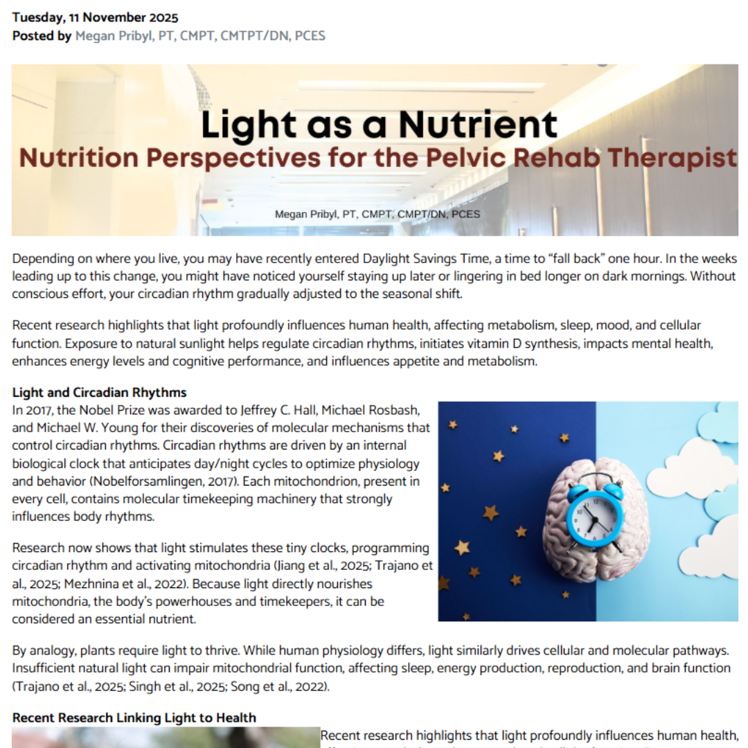
Objective: Educate clinicians and drive course registrations
Outcome: Course registrations increased by 72% to sell out
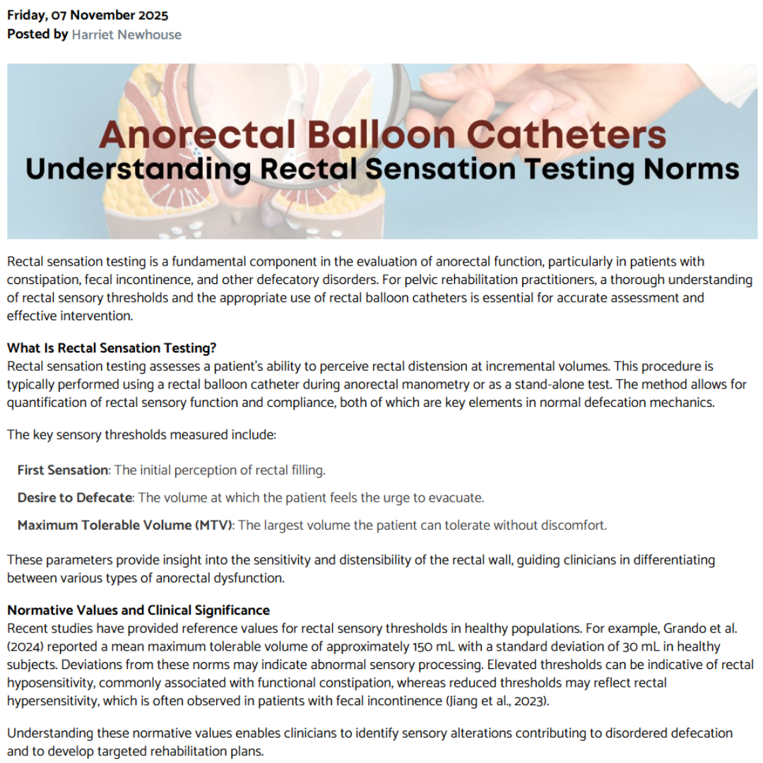
Example: Anorectal Balloon Catheters — December 7, 2025
Original Writing Example
Editing & Optimization Example
Objective: Educate clinicians and drive course registrations
Outcome: Course registrations increased by 40%
Example: Nutrition Perspectives for the Pelvic Rehab Therapist — December 6-7, 2025
Integrated case study: Brand & Execution
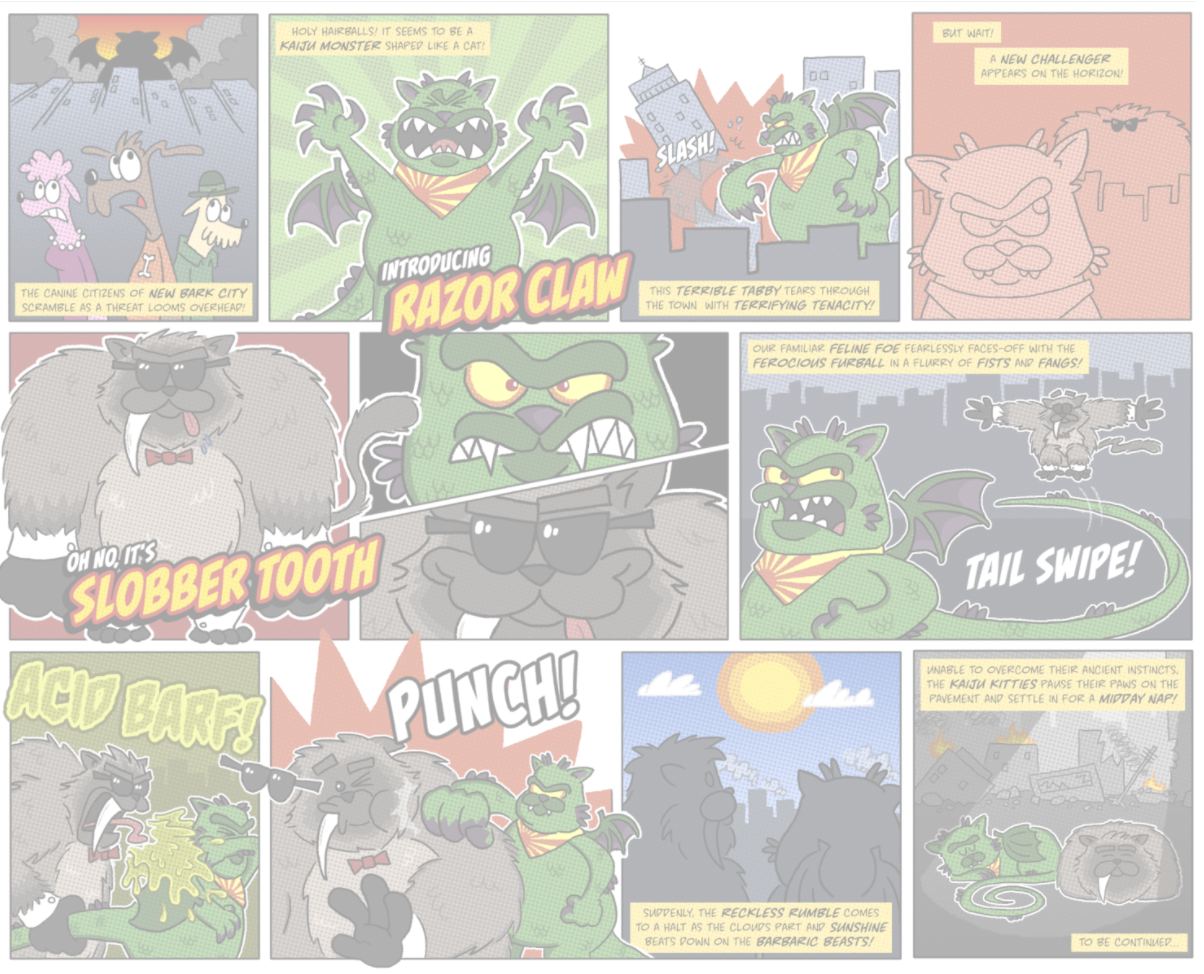
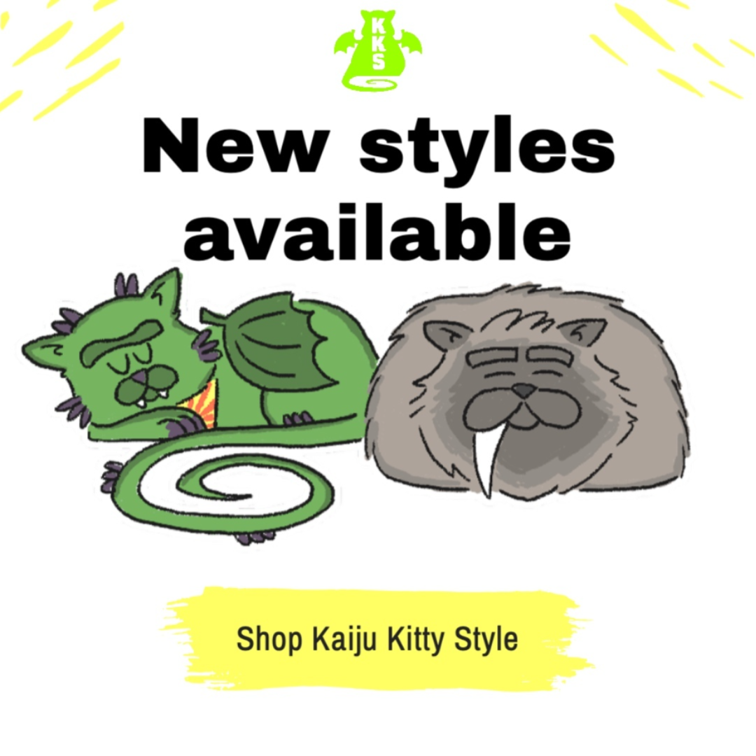
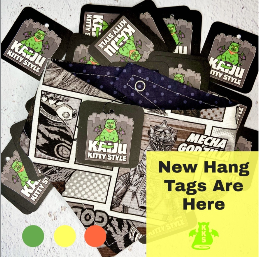
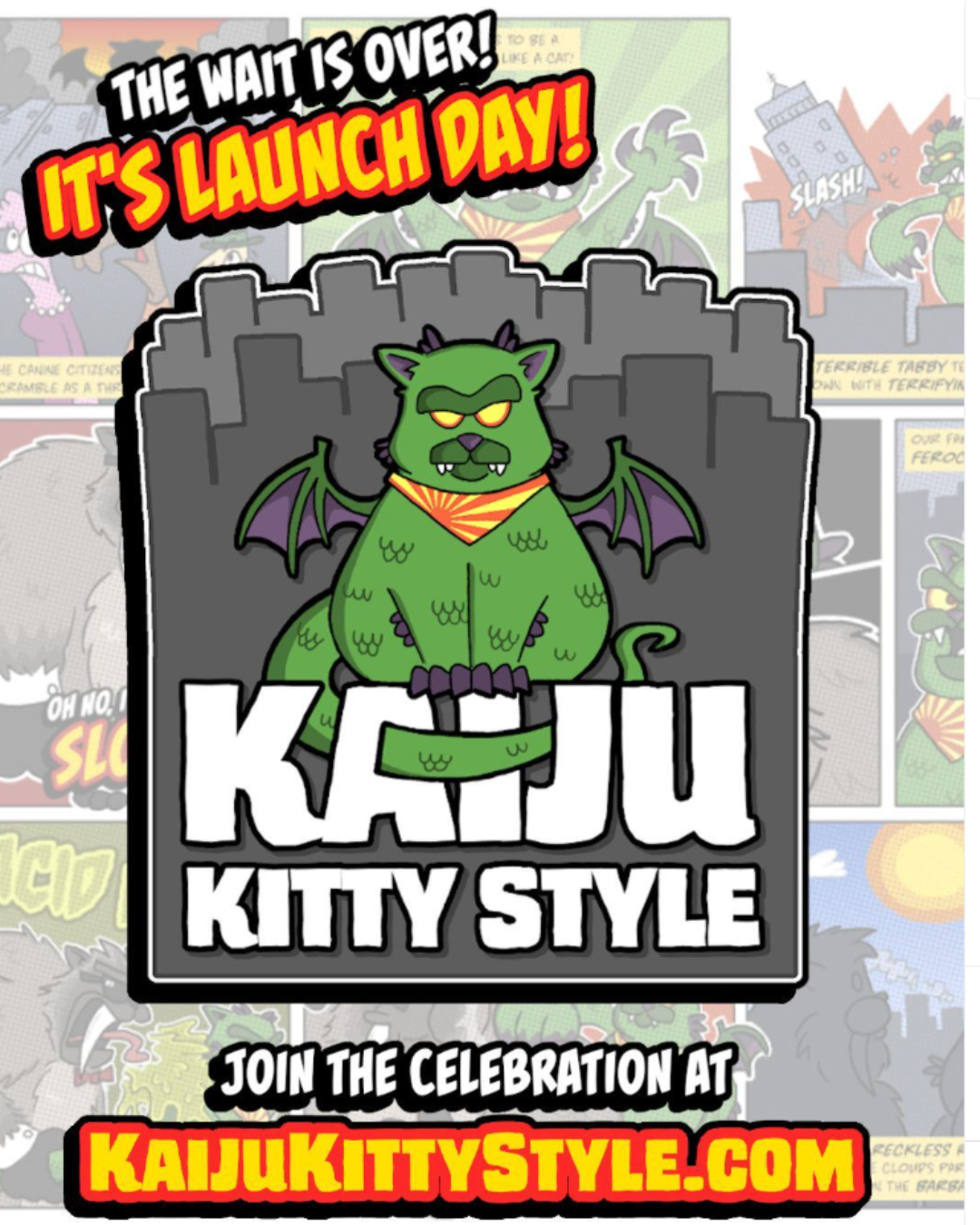
Kaiju Kitty Style Launch
Pet accessory retailer specializing in geek and nerd-inspired bandanas and bowties
Kaiju Kitty Style launched as a niche pet accessories brand designed for customers who wanted playful, fandom-driven flair for their pets. The goal was to create a bold, character-driven brand from the ground up and bring it to market with a strong visual identity, e-commerce presence, and social-first launch strategy tailored to the pet community.
Overview
As a new retail brand, Kaiju Kitty Style had no existing identity, audience, or digital presence. The challenge was to translate a highly specific concept—comic-inspired kaiju cats—into a cohesive brand system that felt fun, distinctive, and commercially viable, while also standing out in a crowded pet accessories market.
The challenge
I led the brand and launch strategy end to end, with responsibility for concept development, visual identity, messaging, website design, and launch marketing.
Work began with defining the brand personality and visual language, followed by development of a character-driven system built around a cast of Kaiju Kitties. From there, the focus shifted to creating a launch-ready e-commerce experience and social presence designed for discovery and engagement within the Instagram and Facebook pet communities.
Role & approach
• Full brand identity development, including logo, color palette, typography, and comic-inspired visual system
• Character concepting and illustration direction for the Kaiju Kitty cast
• Brand voice and messaging aligned to geek and pet culture
• Website design and build with a colorful, comic-style aesthetic
• Social media launch strategy tailored to Instagram and Facebook pet audiences
• Coordinated pre-launch and launch content to build awareness and momentum
The solution
• Successfully launched a fully realized retail brand with a distinct, character-driven identity
• Established a recognizable visual and narrative system across website and social channels
• Built an engaged social presence within the pet and fandom communities
• Created reusable brand and content assets to support ongoing marketing efforts
Results & impact
This project demonstrates how a strong, concept-led brand system can bring personality, cohesion, and clarity to a niche retail launch—especially when visual storytelling and community-driven platforms are central to discovery.
Scope & timeline
Project-based engagement · three-month lead-in, brand identity, website design, messaging, and social launch execution.
Key takeaway
Kaiju Kitty Style ceased operations in 2024. The brand’s social media presence remains live and reflects the original launch strategy and visual system.


More Work
Ongoing updates and refinements to certification and course pages to improve clarity, usability, and conversion.
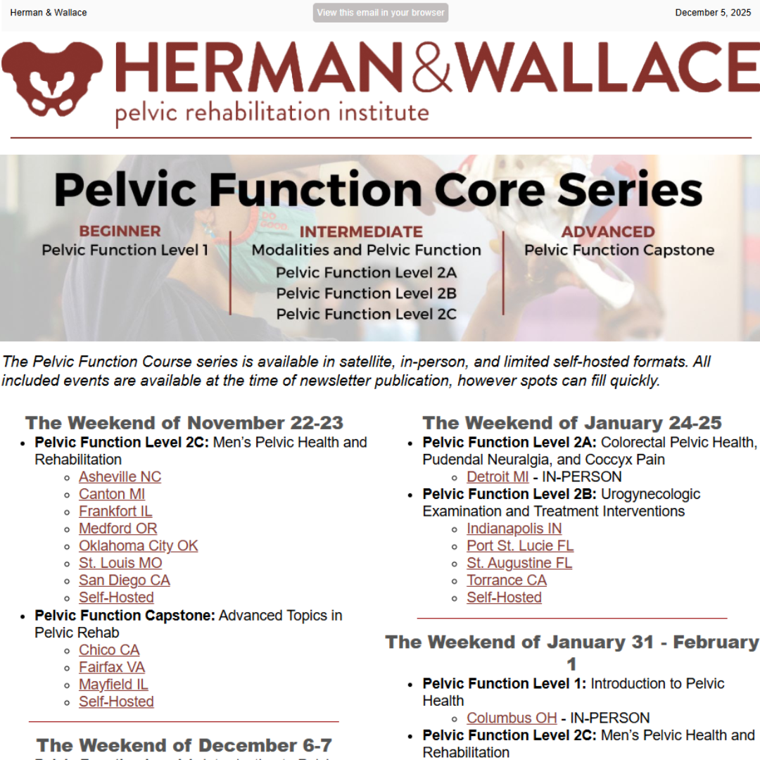
Website Support
Campaign planning and content execution to support course launches, certifications, and ongoing clinician engagement.
Social Media Planning & Execution
Strategic content planning aligned to course schedules, instructor expertise, and enrollment cycles.
Editorial Calendar Development
Analytics & Performance Optimization
Monitoring and analysis to inform content priorities, campaign timing, and iterative improvements.
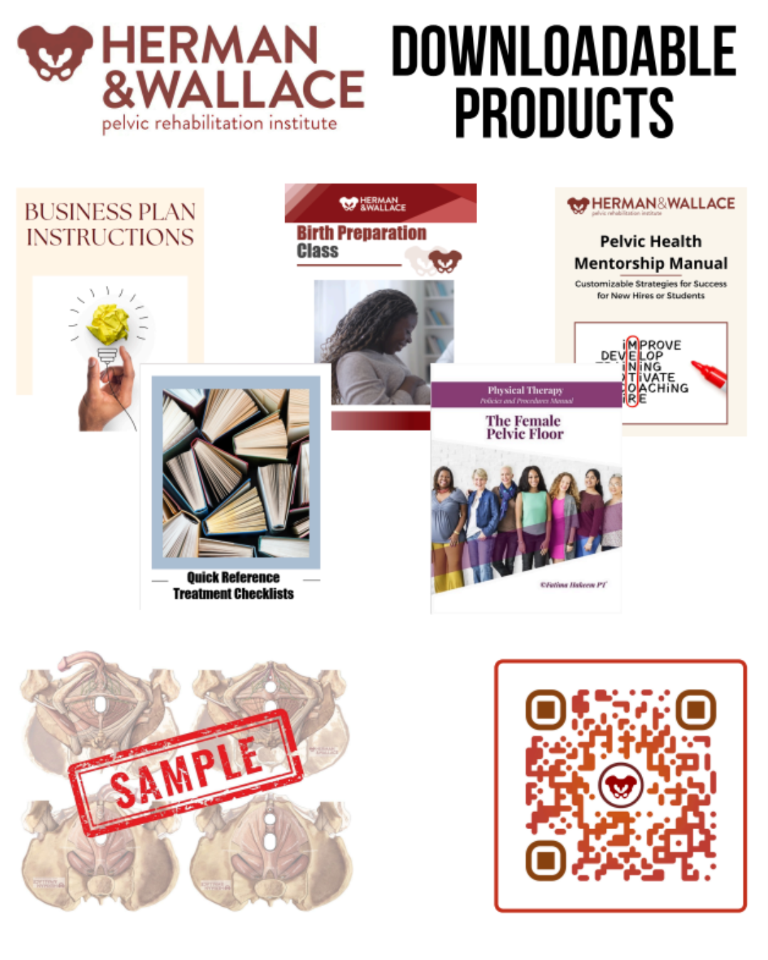
Photo selection, editing, light video editing, and flyer creation to support web, social, email, and event communications.
Photography, Video & Print Assets